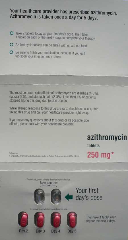
This does a great job of explaining what you need to know clearly. While this presentation for Azithromycin doesn’t prevent a mistake it sure makes it much more likely that the process can be completed successfully. We need more effort in creating such clear instructions.
Visual clarity is more important than lots of words. Applying that concept is not as easy as it sounds but it is a very important idea for instructions to end use and instructions for processes in your organization. Expecting people to read much is just setting yourself up for failure when they don’t bother (you should consider psychology, and how people will actually use your instructions not how you want them to).
via: Prescription UI
Related: Using Design to Reduce Medical Errors – Visual Instructions Example – Visual Work Instructions – Standardized Work Instructions – Health Care Pictographs – 5s – Edward Tufte’s: Envisioning Information

