
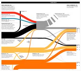
Karl Hartig displays some excellent charts that he created (for the Wall Street Journal) on his web site. The charts seem very similar to what would result from applying Edward Tufte’s ideas. Rarely do I see charts that do such a good job of visually displaying data. The lack of such effective visual display of information is another example of how much improvement could be made just by applying ideas that are already published.
The Energy production consumption chart is especially well done I think – pdf version of the energy chart.
Via, The best charts I’ve ever seen [the broken link was removed].
Edward Tufte’s books are great:
- The Visual Display of Quantitative Information
- Visual Explanations: Images and Quantities, Evidence and Narrative (displaying data over time)
- Envisioning Information
An Interview with Edward R. Tufte by Mark Zachry and Charlotte Thralls
Edward Tufte’s web site


Pingback: Curious Cat: Edward Tufte's new book: Beautiful Evidence
Pingback: Data Visualization Example
Pingback: Curious Cat Science and Engineering Blog » The Value of Displaying Data Well
Pingback: Curious Cat Management Improvement Blog » Communicating with the Visual Display of Data
Pingback: Curious Cat Management Improvement Blog » Data Visualization