Human proof design is design that prevents people from successful using the item.
It is similar to mistake proofing except instead of prevent mistakes it prevents people from using it.
When you see human proof design you will often see signs to tell people how to use the device that has been human proofed. Common instances of this are hotels that have shower designs so opaque they need instructions on how to use a device most people have no problem using if they are not human proofed.
Human proof design is often created by a subset of designers that care about how something looks more than how it is used.
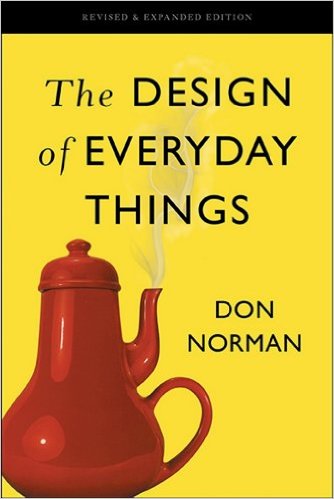
Most people prefer designs that are beautiful without being human proofed. The Design of Everyday Things is a great book on designing beautifully with customer focus.
A sign your design is human proofed is that a sign or manual is needed for people to use it.
Most human proof design can be identified very simply by having regular people try to use the item. Watch what they do and when they struggle to use it, many problems will be very obvious. You can’t use people in this effort that are significantly different from the normal users.
In several areas I see these failures quite often. Hotel rooms are a common source of problems. The light switches are often very odd and I have to search all over to find out how to turn on or off different lights.
Another area in hotels (and sometimes fancy restaurants) are faucets. The more expensive it is the more likely faucets are to be confusing in my experience. It seems they are so focused on being cool that they forget hundreds of different people have to use the controls every year and an design that is not obvious is not wise. In hotels the shower and sink facets have basic usability issues (how to turn on the water, how to adjust the temperature) far too often.
Sensible companies figured out long ago rental customers are a great source of usability data. Car companies can get great insight into what confuses people for example from rental car customers.
There are plenty of things that are designed very well. For example car companies pointing out which side of the car has the gas cap (which is shown with a simple arrow on the dashboard).
Apple has done a great deal to show what can be accomplished with good design. They design products to work without thought or need of manuals to do most things. They understand the value of beautiful design and making things easy and obvious to use.
Related: Visual Management and Mistake-Proofing for Prescription Pills – Customer Gemba, go see how your customers use what you offer – Great Visual Instruction Example – Usability Failures (63% of the returned cell phones worked as intended and customers still think they are broken)


